Responsive Website Development for Dynamic Online Experience
Thanks to the innovative technologies now available, web designers can create websites that support multiple platforms with various types of screen size or resolution. Website development (Joomla, WordPress, PHP etc.) evolved into responsive web design which serves for excellent mobile browsing purposes as well as for web business development.
Gadget users thus get a great web experience on their favorite device (mobile, smart-phone, tablet, laptop etc.), while marketers enjoy traffic increase and improved sales. Having multiple websites for different resolutions no longer seems to be the right option given the extensive amount of work and the money investment into maintaining and updating them.
The advantages of responsive web design
Website development has become a lot more cost-effective with the use of a wide variety of software programs that are often inter-related. Joomla for instance is based on PHP and MySQL. The benefits of building responsive websites include:
- Little server space;
- The ability to create company identity;
- No need for different URLs;
- Easy updates and maintenance;
- Less costly.
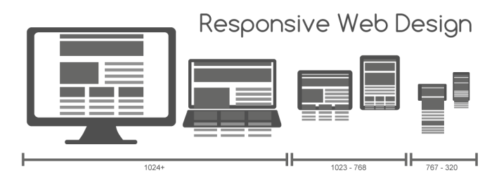
This approach to web development consist of a combination of layouts and grids, images, CSS media queries and CSS transitions. When the user switches from the laptop to the smart-phone, the website needs to automatically accommodate to the image size, resolution and scripting abilities of the mobile device. This is the automatic response to users’ preferences.
Web design improvements!
Flexibility in website design has significantly improved over the last few years. While not long ago, the only design flexibility was in text and layout columns, now things have become a lot more flexible with automatic adjustment in pictures and unbreakable layouts.
Here is how the website layout changes with an automatic switch to a mobile device:
- A 4-column layout automatically simplifies into 2 columns;
- The 1292 wide screen adjusts to a 1025-pixel width screen.
Many web designers will not go for pixel values and choose non-fixed layouts so as to avoid various limitations that derive from the definition of such values.
Dynamic websites support business development
Lots of business owners have come to realize that their website design makes a difference when trying to get ahead of competition. Dynamic websites are built using PHP open source language.
- PHP does not require special licensing for web design;
- It provides attractive, user-friendly websites.
- PHP is search-engine friendly.
- It operates on any type of server whether Linux or Windows.
- Dynamic websites load a lot faster as they require less code.
- It includes a security function that prevents malware and virus attacks to the website.
- It supports all open source platforms: Joomla, OpenCart, Drupal, WordPress, Magento etc.
A dynamic website is user-friendly and an excellent e-commerce platform. It’s so easy to maintain that even a website owner can run the simple changes in text and images, without depending on a web design company.
The website development (Joomla, WordPress, PHP etc.) landscape is shifting at such speed that professionals are faced with a larger number of devices, browsers and input modes than ever before. This triggers lots of changes and avid searches for shortcuts and fixes to provide a great web experience regardless of the mobile gadget used.


